After years of running LiteHouse Painting and repainting homes that were “just done a few years ago,” I’ve seen the same mistake repeat itself. Homeowners fall in love with color trends emotionally, apply it everywhere, and then call us back wondering why the space suddenly feels cold, dated, or lifeless.
That disconnect is happening right now with the 2026 Color of the Year, Cloud Dancer (#F0EFEB). On paper, it promises calm and simplicity. In real homes, the reaction has been mixed at best. At the same time, alternative forecasts like WGSN and Coloro’s Transformative Teal are gaining momentum for a very different reason—depth and adaptability.
As professional painters, we don’t reject color trends. We translate them into choices that actually work long-term.
Why Choosing Color Trends Wisely Matters More Than Ever
Trend Cycles Are Shorter Than Your Paint Job
Social media has compressed trend cycles dramatically. What used to last a decade now feels tired in three to five years. That’s a problem, because paint is not a low-commitment decision.
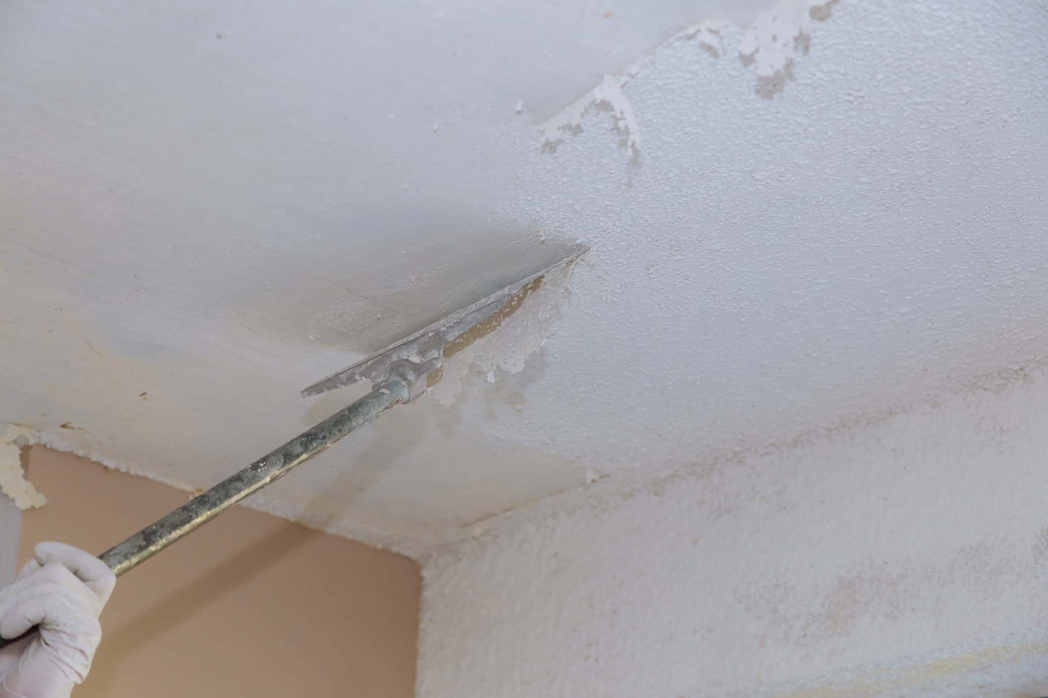
When homeowners follow color trends blindly, they often end up repainting long before the coating itself fails.
Repainting Is Expensive and Disruptive
A repaint isn’t just paint. It’s prep work, labor, scheduling, and disruption to your daily life. From my experience, most regret-driven repaints could have been avoided with better upfront color strategy.
What We See After the Hype Fades
The colors that get repainted first are almost always trend-driven. The ones that still look intentional after 10 years are rarely tied to a specific year’s forecast.
Genius Tip #1: Understand What Color Trends Are Actually Designed to Do
Trends Reflect Mood, Not Longevity
Forecasted color trends are selected 18–24 months in advance. They reflect cultural emotion, economic sentiment, and design direction—not how a color will feel in your living room five years from now.
Pantone vs WGSN & Coloro
Pantone’s Cloud Dancer leans into minimalism and restraint. WGSN and Coloro’s Transformative Teal is data-driven, focused on adaptability and emotional resilience. Both are valid—but they serve different purposes.
The mistake homeowners make is assuming all color trends are meant for full interiors. They’re not.
Genius Tip #2: Read the Economic Signals Behind the Color
Recession Color Trends Are a Real Pattern
During economic uncertainty, palettes retreat. Whites, beiges, and muted off-whites dominate. That’s exactly what we’re seeing with current color trends.
Cloud Dancer as a Case Study
Cloud Dancer (#F0EFEB) is positioned as calming, but many reactions describe it as emotionally flat. That’s not accidental. It mirrors caution, not confidence—and those moods don’t age well visually.
When economic confidence returns, restraint feels dated fast.
Genius Tip #3: Be Extremely Careful With Trend Off-Whites
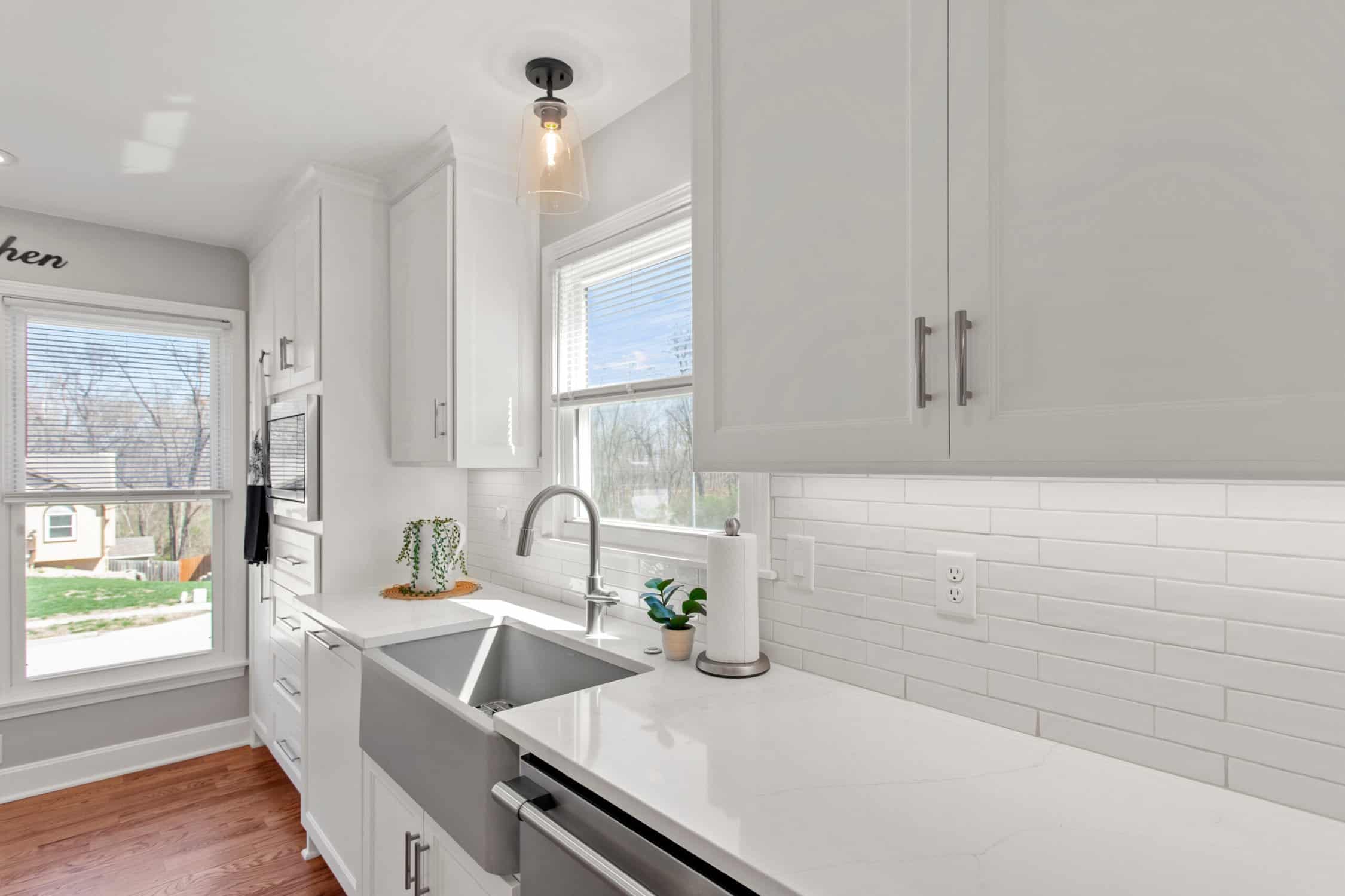
Off-White Is Not Neutral in Practice
Off-white color trends rely heavily on undertones. Slight warmth or coolness becomes exaggerated over time, especially as lighting conditions change.
Maintenance Is the Hidden Problem
Off-whites show scuffs, shadowing, and touch-up marks faster than mid-tone neutrals. We see more repaint requests for trendy whites than almost any other category.
From a professional painter’s perspective, custom-balanced neutrals outperform trend off-whites in both appearance and longevity.
Genius Tip #4: Compare Multiple Trend Forecasts Before Committing
2026 Is a Split Year
On one side, you have Pantone’s Cloud Dancer—safe, restrained, minimal. On the other, WGSN and Coloro’s Transformative Teal—adaptive, grounded, and emotionally richer.
When color trends are divided like this, risk increases. Consensus trends tend to age better than polarizing ones.
Why Transformative Teal Is Resonating
Transformative Teal works with wood, stone, and metal finishes. It brings depth without overwhelming a space. That adaptability is why it’s gaining traction across residential and commercial environments.
Genius Tip #5: Use Color Trends Strategically, Not Universally
Where Trend Colors Work
Trend-driven color trends perform best in controlled applications. Accent walls. Powder rooms. Feature zones. Limited-scope updates.
Where They Fail
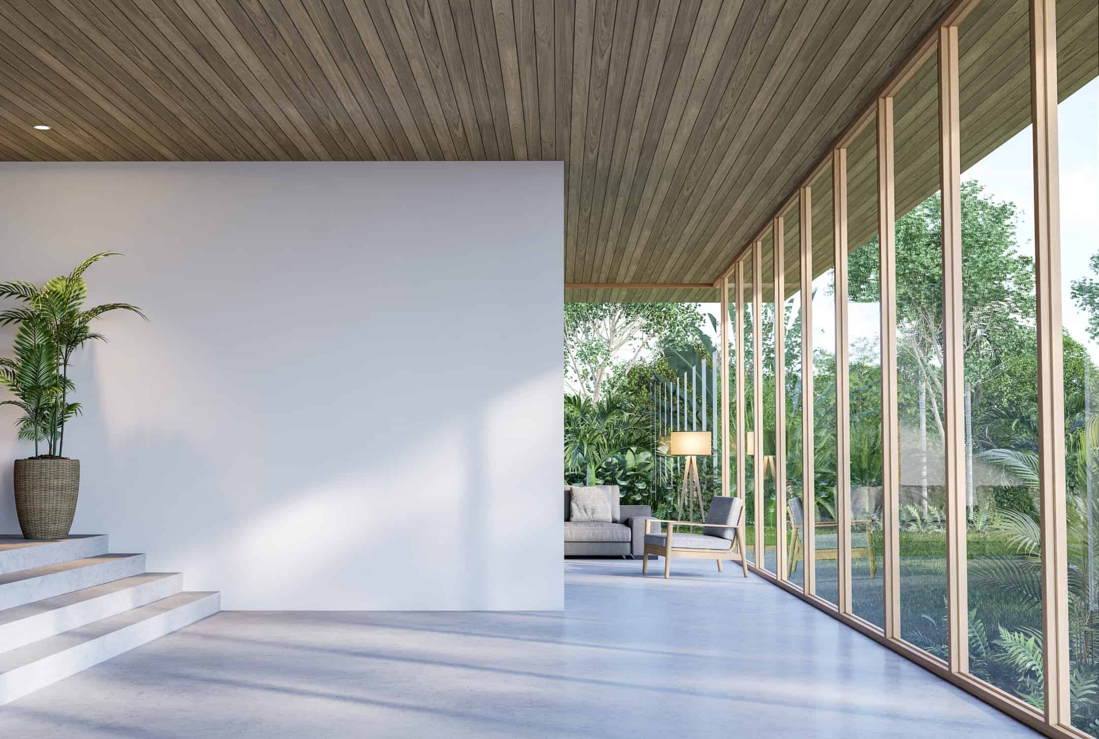
Whole-home interiors are where trends fall apart. Especially in open-concept spaces, emotional fatigue sets in quickly.
Cloud Dancer, in particular, performs poorly as a dominant color in lived-in spaces. It feels sterile over time.
Genius Tip #6: Prioritize Emotional Longevity Over Initial Impact
Living With Color Is Different Than Viewing It Online
A color that feels calm in a photo can feel dull in daily life. We hear it constantly: “It looked better online.”
That’s the danger of emotionally driven color trends.
Repaint Cycles Tell the Truth
Trend-heavy palettes are usually repainted within 3–5 years. Well-chosen, timeless foundations last 8–12 years or more.
How Professional Painters Choose Colors That Last
At LiteHouse Painting, we evaluate lighting, architecture, fixed finishes, and surface condition before recommending anything. Trend popularity ranks low.
That’s why our interior painting projects age better than most.
Blending Trend Influence With Timeless Foundations
Timeless colors are not boring. They’re balanced. They work across lighting conditions and décor changes.
The smartest way to use color trends is through layers—furniture, décor, artwork, or even a cabinet respray—not permanent wall saturation.
Choosing Color Trends Wisely in 2026 and Beyond
The reaction to Cloud Dancer reinforces a lesson painters have learned repeatedly: colors chosen for caution often age the fastest. Minimal, emotionally flat palettes tied to uncertain times rarely stand the test of time.
Adaptable, grounded hues—like Transformative Teal—align more closely with palettes that historically perform well.
The goal isn’t avoiding color trends.
It’s using them with intention, restraint, and professional insight.
For homeowners planning interior painting projects in Springboro, OH, that difference matters more than ever.